A simple room can be made visually interesting by adding color, but choosing the right hues can be difficult. When choosing color schemes for modern homes, you have come to the right article.
The selection of interior color schemes for an interior space is largely subjective; thus, there is no right or wrong way to go about it. To produce a great color combination yourself, you don't always have to consult an interior designer or adhere to color wheel guidelines, color palettes, or design ideas. The most crucial thing to think about is selecting a color scheme that you love.
The following interior color scheme selection advice will assist you in furnishing spaces with hues of perfect colors that exquisitely capture your unique style.
Showcase your personal style.
Even if they would never decorate a family room in their own home in the same way, people would still respect your honest decorating since it is unique to you. That implies that you should go ahead and decorate every room in your home in red, white, and blue. Any hue can seem beautiful as long as it feels fresh and complements your own style.
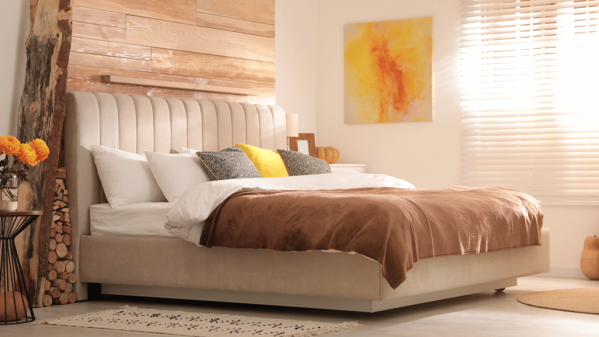
Choose a color scheme from the largest pattern in the space.
Choose your favorite colors from the pattern in any large artwork, vivid carpeting, or patterned upholstery. Look to the whites and beiges in the pattern for a neutral wall paint color palette.
Cool and warm in contrast
Earthy tones or neutral shades don't have to be boring by combining chilly gray with warm honey-colored hues or cool tones. The juxtaposition between darker shades of these two opposites produces just enough tension to jolt the otherwise sleepy area, even though the overall impression is peaceful.
Make use of the color wheel.
Analogous color schemes, or hues that are adjacent to one another on the color wheel, like blue and green, are typically more calming, feel laid-back, and look well in informal or private settings.
This is a sensible tactic for your bedroom—a complementary color scheme—where you should unwind and get well.
Adopt a monochrome style.
Emphasize your preferred color by utilizing it exclusively in a compact area, such as a bathroom. Kelly green, a preppy color, and blue are used to create a cheerful master bathroom. The intense blue tint, when juxtaposed against the white walls and floors, is striking without being overwhelming. This will also look good in your dining room, as it may pop into your visitors's eyes.
Decorate vertically, going from dark to light.
Using darker color values for the floor, medium color values for the walls, and light color values for the ceiling is a true "cookbook" method of improving the appearance and inviting feel of any space without taking many chances. Every internal area is a duplicate of the nature-inspired color palette of the exterior. The outside world is often lighter in the sky, medium-valued when it faces us directly (buildings and trees), and darker underneath us (the earth itself).
Apply the 60-30-10 guideline.
Divide the color palette into three categories when designing a living space: sixty percent should go toward the walls (the primary color), thirty percent should go toward upholstered furniture (the secondary color), and ten percent should go toward accessories (the accent color). The complementary colors in this color scheme are guaranteed to be harmoniously balanced and to have the perfect amount of pop for eye appeal.
Take Advice from Your Clothes
You should paint your home with color palettes that suit you, just as most people choose clothes in hues they find attractive and comfortable to wear. Consider purchasing a navy sofa if denim is your go-to color; if bright yellow is your preferred hue, consider incorporating some zesty highlights with pillows or other items.
Returning to black
The black clarifies the rest of the room's colors. They say some people prefer black canvas to start with, then pop some colors. Some say to try a black lampshade or black vase for a little splash of color; paint your kitchen's base cabinets the high-drama color for a larger effect.
Follow Gray's lead.
Gray, the hottest neutral right now, looks great in any interior design. Because of its chameleon-like properties, gray can appear warm or chilly and goes well with pastels off white as well as bold hues like hot pink, light blue, Kelly green, or lemony tones.
Make little areas shine.
Avoid painting a tiny room in your house white in an attempt to make it appear larger. Alternatively, use a bold color option to give kids room around it and greater impact. Allow the light to fill your large rooms and your little rooms and engulf you.
Avoid the temptation to choose the paint color for a space before you've planned the interior color schemes and schemes.
Rather, since paint is so affordable and can be mixed with almost any interior color scheme, it's best to begin your color hunt with less adjustable room elements like wallpaper, tiling, furniture, and fabrics. Next, choose paint colors based on those components.
Here are some suggestions for reducing the number of colors you can choose:
Find Inspiration for Your Color Palette
Finding inspiration should always come first before starting any redesign project. Whether it's getting out in nature, looking at magazines, or scrolling on Pinterest, finding inspiration that matches what you're looking to achieve for your space is important when it comes to selecting colors. This might assist you in seeing how various, more than neutral, tones, shades, and color combinations appear in various settings and uncover recurring themes in your favorite color schemes.
Choosing a color scheme can be made simple by basing your selections on a picture or object that you adore. This could be an attractive piece of art, an area rug, a picture you saw online, or a patterned cloth. Select certain primary colors from the pattern and incorporate them into your interior design decisions. Consider the dimensions of every shade to replicate a correspondingly harmonious interior color scheme and palette.
Consider color value.
Remember to take value—a term that describes a hue's lightness or darkness—into account while selecting colors. A multi-hue palette can be kept from looking haphazard by incorporating a variety of values within your color scheme. Consider using one chic black, one light gray, one beige, one dark, and one brilliant hue in every room. Depending on your taste, a certain color will serve as the room's primary hue.
Plan Your Home’s Color Scheme
Prepare ahead of time if you're nervous about color. Make a note of the furnishings, wall colors, and carpets that will be in every area of your floor plan. Collect paint chips or swatches of cool colors that correspond to the hues of such things. Examine the places for both good and bad qualities, and record your findings. From the list of commendable qualities, identify focal points and bright colors.
In addition to paint colors, think about the items that will be included in the home decor and palette, the vibe you wish to create, and how one space will flow into the next. Take each room in the house and plan it. Use one color in each room, but in various proportions—for example, blush pink as the wall color in one room and an accent color in another—to create a simple whole-house color scheme.
Consider how light affects colors.
Consider the effect of the lighting. Since color is a reflection of light, a living room, dining table itself, or family room's lighting conditions will have a big influence on the color scheme chosen. Play around with the way that brown color palette is affected in fabrics, paint, furniture, and other surfaces by natural light or light from lamps and recessed lighting.
Since daylight has almost constant intensity across the visible spectrum, it is regarded as the ideal light source. Since different levels of atmosphere allow the sun's rays to pass through, natural light fluctuates from sunrise to sunset. Spend some time in the room during the day and observe how the changing light affects it before deciding on a color scheme. For instance, a room in the house that is solely exposed to the north gets less light than other rooms. In a room like that, a warm color scheme would work well to reduce shadows and adapt to longer periods of artificial light.
The light from incandescent bulbs is warmer and redder than that of the sun. Conversely, bluer, colder light is typically produced by fluorescent bulbs. Choose colors for a space that is mostly used before sunrise or after sunset only after taking into account the room's lighting. Remember that every color that contains white will reflect the colors around it. For example, a white wall will reflect the color of the ceiling, the carpet, and even the furniture.
Consider the lighting carefully before choosing a color palette or scheme for your room, and especially before painting. Based on the illumination in a particular place, different colors can appear differently, according to Crockett. When selecting a color palette, it's important to take into account factors like how much natural light a room receives, whether it receives none at all, and whether the overhead lighting presents a blue, charcoal gray, mint green, or yellow hue. For example, the way navy blue may look in a master bedroom with many windows is different from that in a room with few windows.
It's not necessary to have a lifelong relationship with the primary color that you choose when adding color to a space. There are numerous methods to include color with subtle accents or sudden bursts of color combinations in a chosen color scheme if you would rather have a neutral background. Rugs, pillows, throws, and window treatments are examples of fabrics and textiles that are ideal for bringing color into a space. They can also be used to add pattern and texture.
Color and personality are combined in artwork by interior designers. Personal collections and accessories can serve as bold and vibrant interior accents. Don't overlook the vibrant colors of organic components like fruit and flowers. When arranged in bowls or vases, they produce a vibrant mass in any area.
Even though neutral colors may seem secure, utilizing color in your home has a lot of advantages. Color is a great way to bring together different furniture types and revitalize old or worn-out pieces. An eye-catching, unexpected splash of color may transform an uninteresting area into a chic, unique one. You can also alter your perception of space by using color. Light colors can make a small space appear larger, whereas darker wall colors will make a large space appear smaller. A dark-colored ceiling can be visually lowered, and a light-colored ceiling can be visually raised.
.png)